
The question that everyone is asking is why designing a Caslon today, when there are already many interpretations and many typefaces inspired by Caslon?
Initially, there was no intention to add a Caslon to the Typofonderie library. But in 2015, a project at ZeCraft ¶1 called for the design of a particular Caslon. This is how the Caslonian was born, influenced by various Caslon cuts, including those of the Fonderie Caslon in Paris.
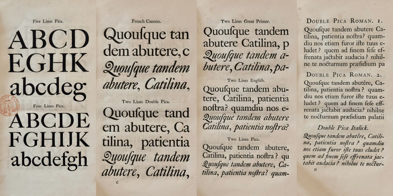
William Caslon, A specimen of printing types. London. Printed by John Towers, 1766. Bibliothèque Mazarine, Paris.
Define the historical trace left by Caslon
Caslon is a more conservative typeface than its contemporaries. ¶2 Indeed, Caslon, influenced by the Dutch style, appeared in 1734, which is later than the pre-modern Romain du Roi in 1692. The English typeface is closely followed by Fournier in 1737, that without more information about the existence of one by the other, we could assume this is a “parallel” design. John Baskerville, who began his career as a punchcutter and founder 1730, will publish his first specimen in 1754, is also considered as an innovator compared to William Caslon. Stanley Morison ¶3 describes Caslon type as archaic, Alfred F. Johnson sees Caslon as a typeface that could have been engraved a century earlier.
Caslon was born as a text face, but at the beginning of the 20th century, with its multiple adaptations, it also became a successful headline typeface. The high-contrast display faces from Caslon models are appreciated for their stylistic extravagance, more expressive than Didot and Bodoni used as display face. They easily reaffirm a nod to the past without being old fashion. This is the main characteristic of Caslon: a diversity according to the cut variants. It is a typeface that is not uniform in its stylistic choices, it is all its charm and what allows everyone to build their own recipe for an idealized Caslon according to their criteria.
Nowadays, low-contrast text faces derived from Caslon models represent the archetype that knows how to disappear in favor of content; and in Anglophone countries, Caslon is in a way, the universal typeface. The expression “When in doubt, use Caslon” is a way of saying that Caslon has become over the years, a default typeface.
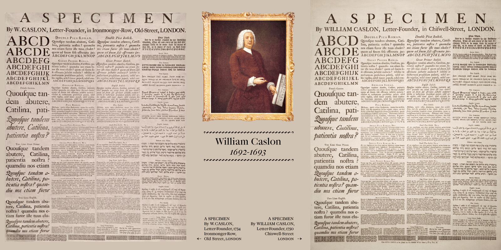
On the left: William Caslon’s specimen sheet, Ironmonger-Row, Old Street, London, 1734. Columbia University, New York. On the right, 1750’s specimen sheet, Chiswell-Street, London. Internet Archive.
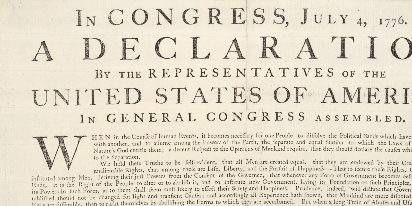
Set in Caslon, the first Printing of the Declaration of Independence, printed by John Dunlap on 4th July 1776.
A look back at the history of Caslon
Contemporary of Fournier le Jeune, William Caslon, ¶4 was reportedly born around 1692–1693 in Cradley, died in 1766 in Bethnal-Green, United Kingdom. He began his apprenticeship career in London as an engraver of ornaments on weapons. Encouraged by printers, he began an activity as a punchcutter, and launched his foundry around 1722, he published his first specimen in 1734, which offered 14 different sizes in roman and italic as well as “exotic” typefaces such as Greek, Hebrew, Arabic, etc.
In 1858, the Philadelphia foundry in the United States acquired Caslon and reproduced them via the electrotype matrices process. The American Declaration of Independence printed in 1776 ¶5 is set in these typefaces, which confirms the influence of the Caslon type foundry, the oldest foundry in London; not only in Great Britain but also across the Atlantic.
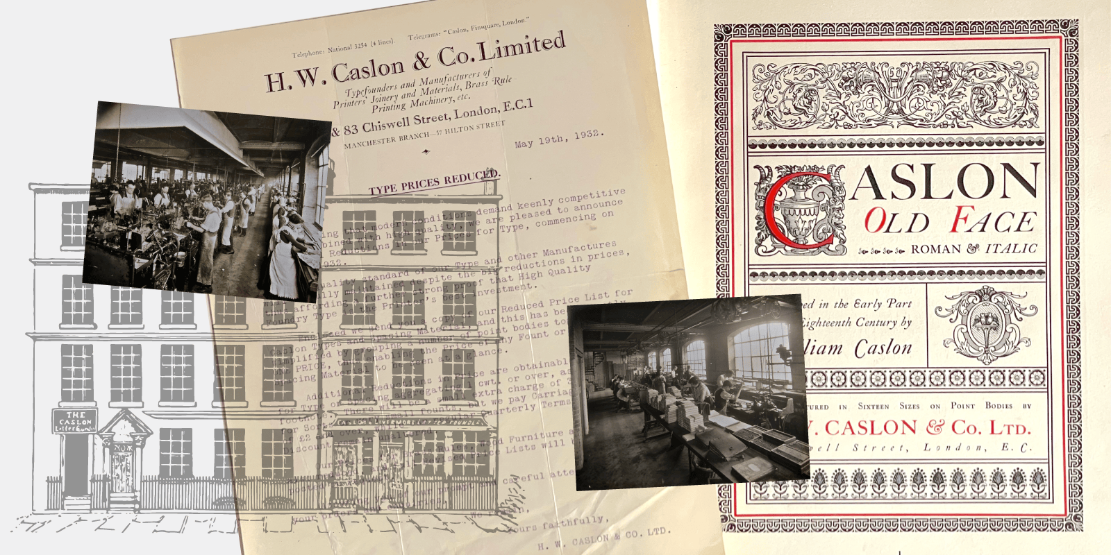
Various view of the Caslon foundry in London. Letter announcing prices drop, 1932. Specimen title page, H. W. Caslon & Co. Limited, 1911.
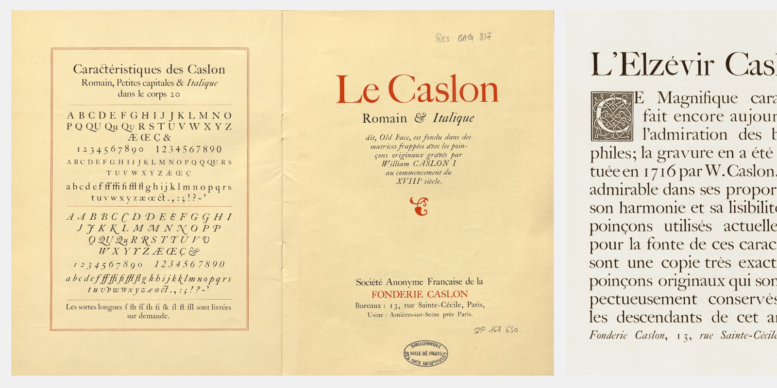
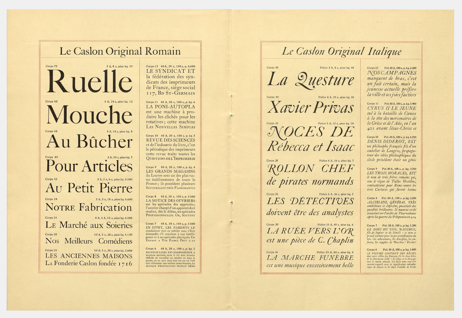
Specimen Caslon Roman, Italic, Caslon “Elzévir” re-engraved, as well various localized versions. Fonderie Caslon, Paris. 1930.
The Caslon type foundry is a complex entrepreneurship and family history, which mixes inheritance, competition between heirs and redemptions, all committed to pursuing the initial success of the Caslon type foundry. Around 1840, Caslon became fashionable again, thanks to the Chiswick Press, which reintroduced the original Caslon typeface for its books designed in a traditional style. In 1874, Henry William Caslon, the last direct descendant of William Caslon, died. It is his manager Thomas White Smith who continues operations successfully, even establishing a branch in Paris. In 1936, the Caslon Foundry ceased its activities, the equipment was sold to Stephenson Blake and Monotype. In France, the Fonderie Caslon will continue its activity until the 1980s. ¶6
The birth of the Caslonian project
In 2015, a project at ZeCraft called for the design of a particular Caslon for a brand of the Estée Lauder group in the United States. This is how the project started with a unique weight in roman and italic. As often, it is better to draw more than the styles desired by the customer, because this makes it possible to adjust over the course of the project. Same to find the right contrast. We had there, the bases of a larger typeface family.
The initial concept was to draw a Caslon that values certain contrasts of proportions that appear in large sizes: the Five-Line pica, Four-Line pica, Two-Line pica, French Canon, Two-Line Great Primer, etc. present in the 1785 specimen are example of this diversity. ¶7 Drawing Caslonian with this objective is both to establish everything that makes a Caslon, while exaggerating certain details, certain proportions that will make it more Caslon than a purist revival, as close as possible to a particular Caslon cut. It’s a bit like a historical film that is inspired by the past, according to our eyes today: nothing is clearly true, but it is charming in some aspects. Historians generally criticize this kind of film set in the past, pointing out inconsistencies, including typographical. ¶8 The result on screen is a sublimated past, without being an exaggeration that could become caricatural. Caslonian was created in this state of mind.
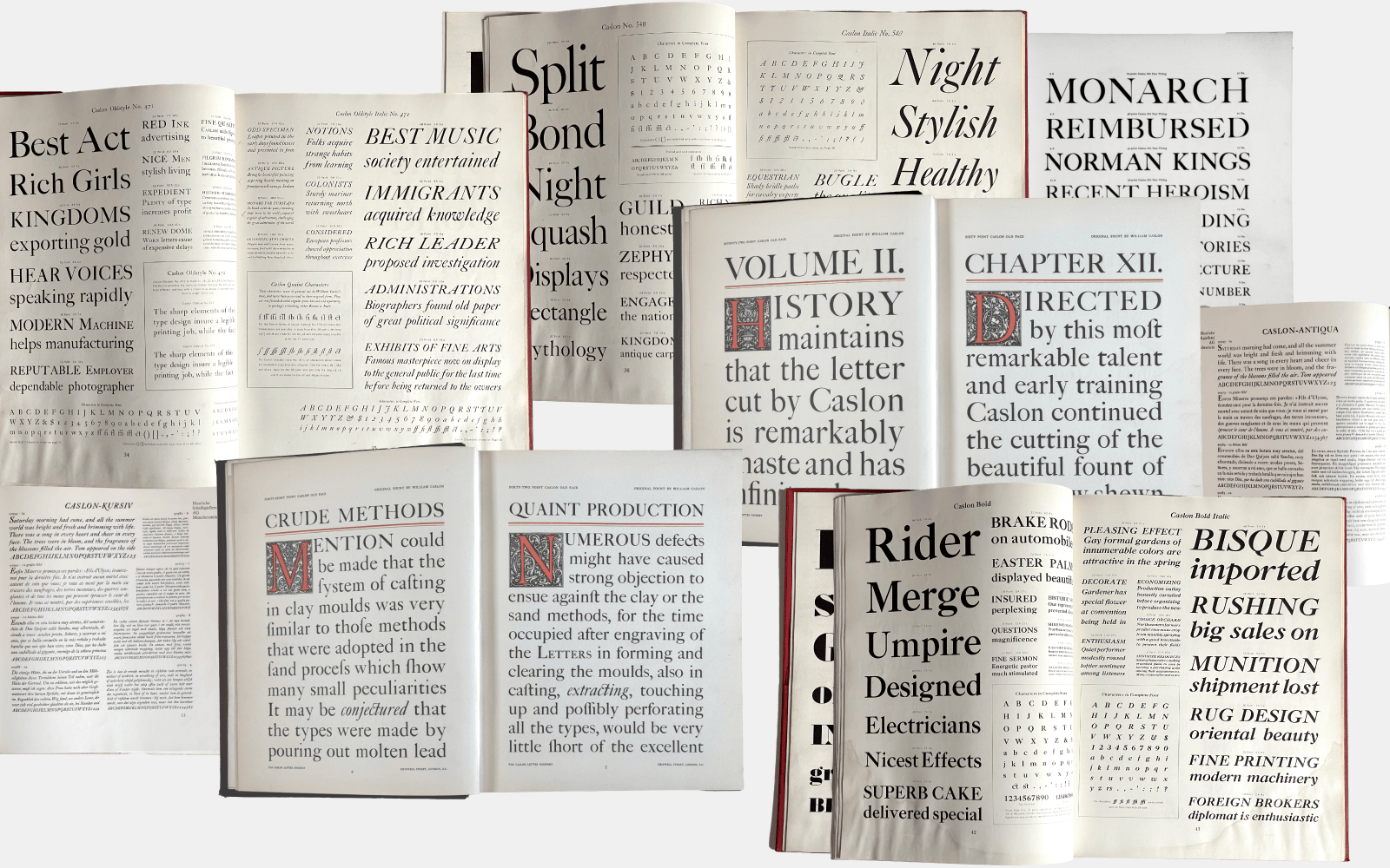
Specimens pages from Caslon Foundry, 1911, London. American Type Founders, 1941, New Jersey. Haas’sche Schriftgießerei, 1940, Basel.
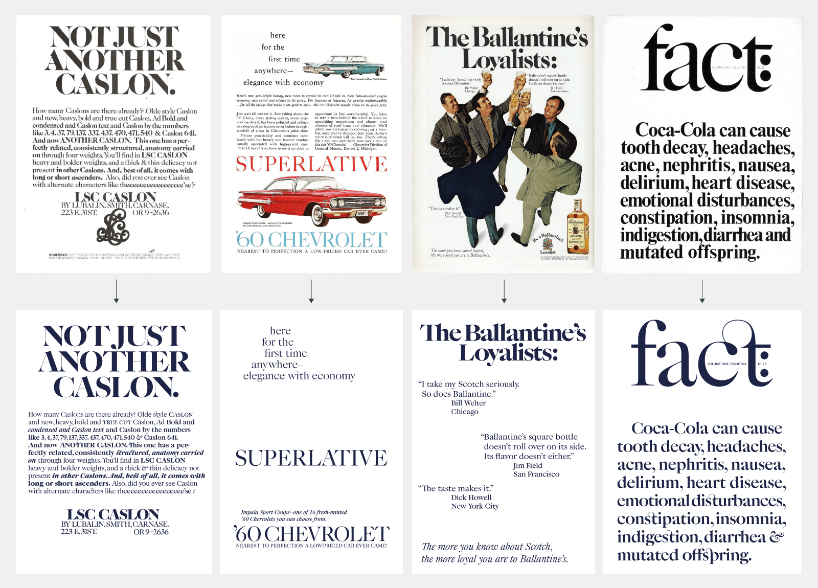
Ads featuring various Caslon from the 60s and 70s such as: LSC Caslon advertisement featuring Caslon No. 223, part of ITC collection. ’60 Chevrolet advertisement. Ballantine advertisement featuring Caslon No. 223. Fact: logo draw by Tom Carnase for Herb Lubalin, based on Caslon 540.
Caslon 471 and Caslon 540 (ATF, 1902), English Caslon Old Style 37 (1903), Caslon Old Style 437, Caslon 3 (ATF, 1905), ITC Caslon No. 223 (Tom Carnase, ITC, 1969), and in digital Big Caslon (Matthew Carter, Carter & Cone, 1993) ¶9 each represent in their own way, this idea of an expressive headline face, with its quirks that make it all the charm of a contemporary Caslon. Caslonian is also a tribute to the style of the International Typeface Corporation (ITC) which transformed historical typefaces into typefaces adapted to 70s and 80s type fashion. ¶10 As you will have understood, Caslonian is not a strict revival, it is rather a typeface that is freely inspired by these headline typefaces that we call Caslon.
Caslonian, letter to letter
The Typofonderie version starts around 2018, with the objective of establishing a more complete family adapted to different uses: Different optical sizes, an Open face version, small capitals, ornate letters, vignettes, etc. Caslonian is drawn with a large x-height, exaggerating certain details and proportions. Particularly visible in the large XL Light version, it is angular in its serif finish, but flexible in its design. Let’s review the different characteristics.
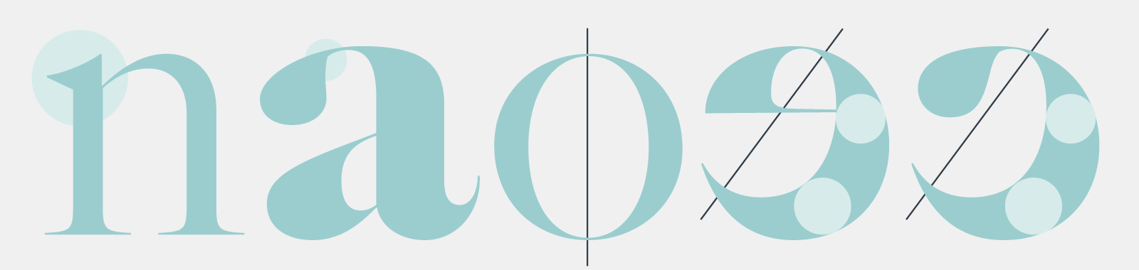
In lowercase, top apex (or serifs) are drawn triangular, some letters are constructed on an oblique axis, others on a vertical axis, according to the aesthetic Caslon canons. Drops have a specific way of attaching to the thin stroke with a subtle angle in a nod to the chisel accidents of the made by punchcutters.
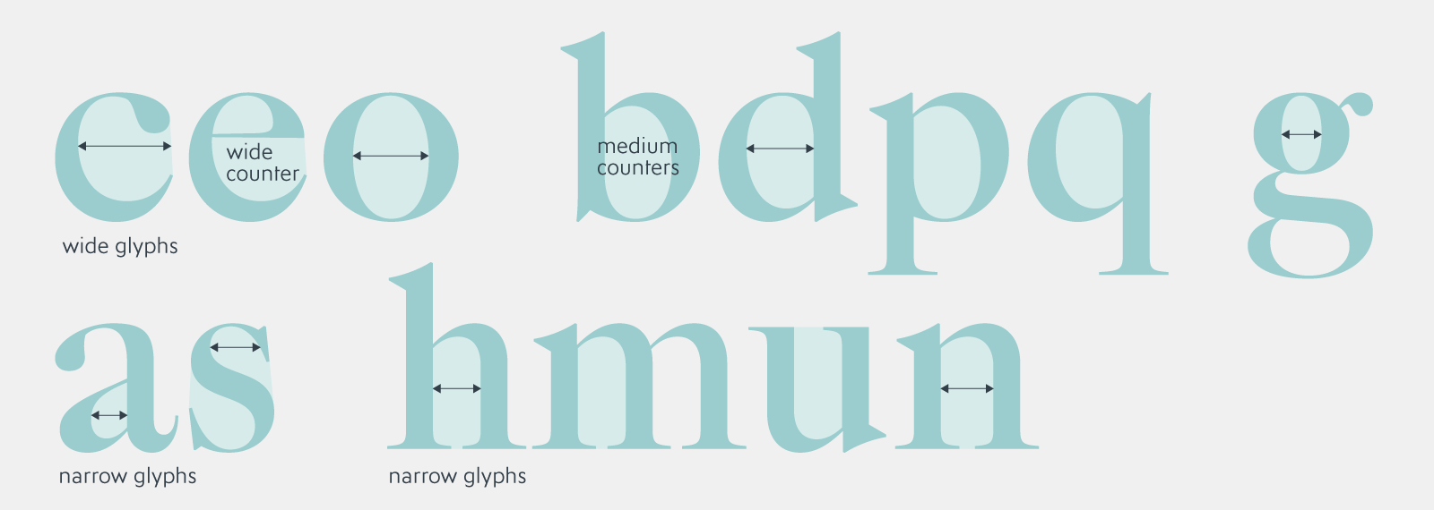
The round letters c, e, o are excessively wider than the b, d, p, q. The h is very narrow, followed by the u and n, m narrower than usually in a contemporary typeface. The c, e have a clear oblique axis, with a curve that towards the horizontal is relatively thick, particularly visible in the heavy weights. The g is drawn with a small counter for the upper part followed by a slightly diagonal horizontal – borrowed from the Caslon Old face 48 pt size – diagonal rarely taken up in contemporary versions. The a is drawn narrow, accentuates its diagonal of the small lower bowl (echoing the small counterform of the e), with a relatively eccentric drop to the left offering a wide open counterform.

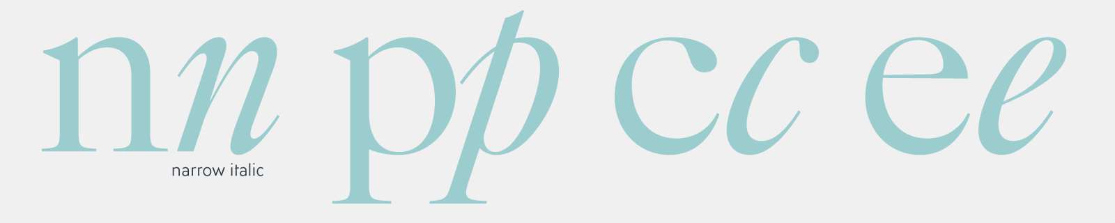
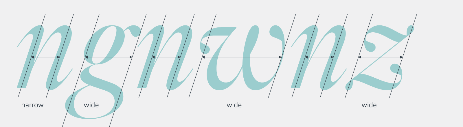
The lowercase s finds serifs similar to the S in capital to reaffirm the angularity; usually the s of a contemporary Caslon does not have these small serifs returns, which are also present in the z, Z, T. The s is the narrowest letter (beyond the i, l of course) of the alphabet. The lowercase letters in italics are frankly slanted, drawn very narrow. Less width contrast in minuscules, because in italics it is the cadenced pace that prevails. Nevertheless, the g, v, w, y, z are visually wider, in order to enrich the texture of the lines set in italic Caslonian.
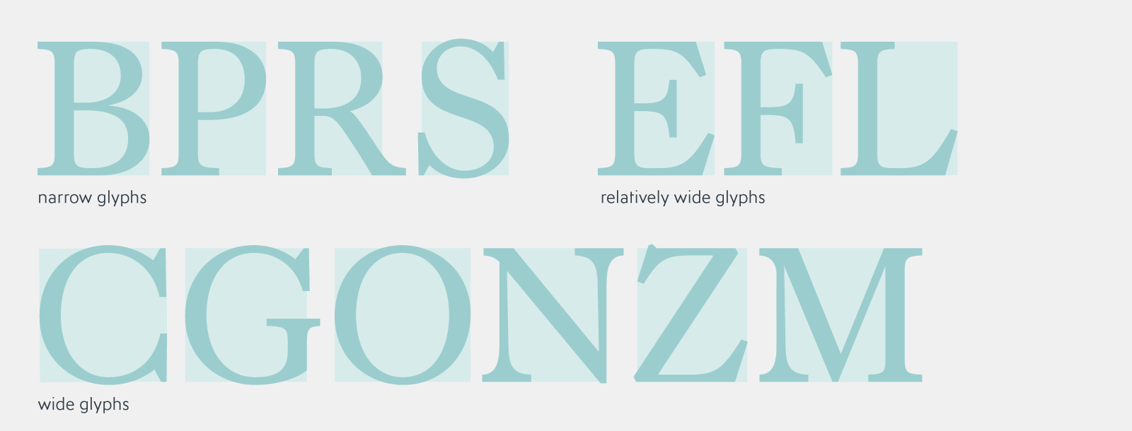
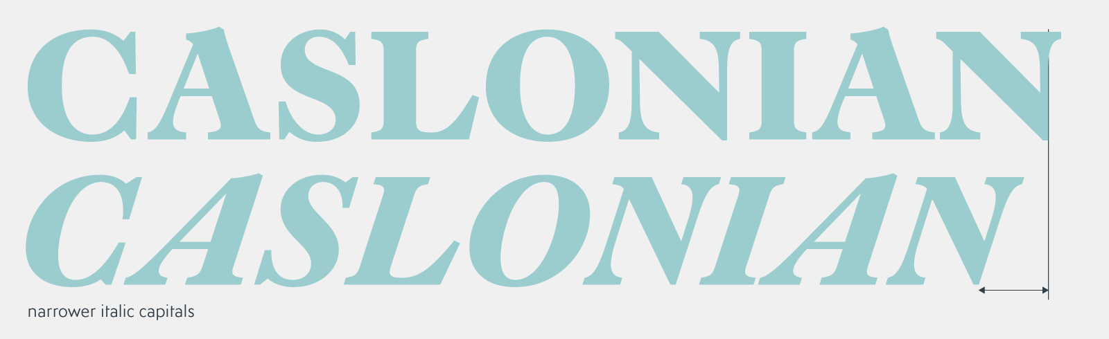
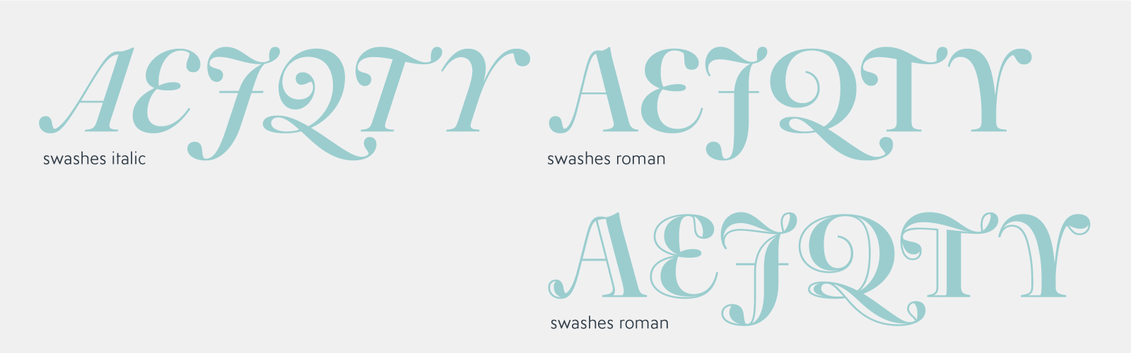
While the Caslon capitals are generally quite uniform in width, in Caslonian, the width of the C is exaggerated – much more than in a Garamond, for example, which will follow the proportions of the Roman capitals and inscriptions of the Renaissance. The E, F, L are relatively wide, while the B, P, R, S are narrower. The diagonal of the R follows the usual principle of Caslon, which starts with a slight curvature – like the ending stroke of the Q – before being straighter. The lower parts of the V, W remain pointed in all weights, particularly visible in XL. The italic capitals are drawn narrower than in roman. The italic versions take up the principles of the capitals in Roman, except the Q. The A, V, W drawn more slanted, with the heavy stem practically aligned according to the slope of the italic to reaffirm a characteristic of metal type Caslons. Swash capitals and small caps A, E, J, Q, T, Y and a decorated ampersand are added, which allow a mix in capitals setting. In Roman, swash version have been adapted, like a happy sprain to the Caslon tradition!
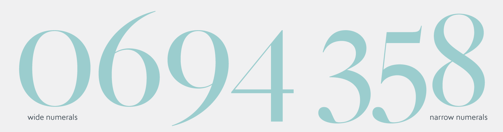
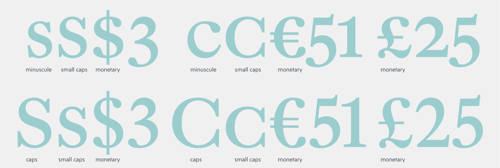
The numerals follow the characteristics of Caslon: narrow eight, six and nine with a relatively large counter, five with rather frank central horizontal, two that almost tilts to the left with in its upper curve, an affirmed horizontal weight like the e and c. Monetary signs are drawn with drops rather than serif terminals, in order to be in harmony when used with numerals.
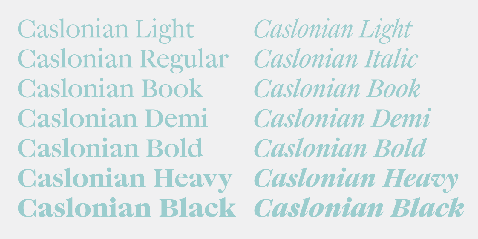
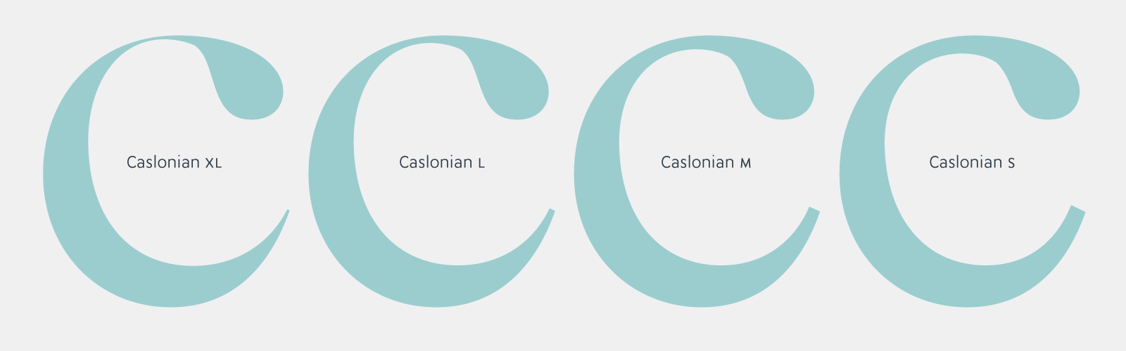
Caslonian is designed in seven weights, romans and italics, according to the Typofonderie Pro (and exclusive) glyphs set: small capitals, various numerals, swash capitals, ligatures, borders and ornaments. Different optical sizes are named in reference clothing sizes in Anglophone countries: S for Small, M for Medium, L for Large, XL for X-Large. Declined in weights and optical sizes, including in the Open face version, a series of ornaments inspired by the borders from Caslon era are available. As a result, mixing the different weights and optical sizes of a border element enriches the setting.
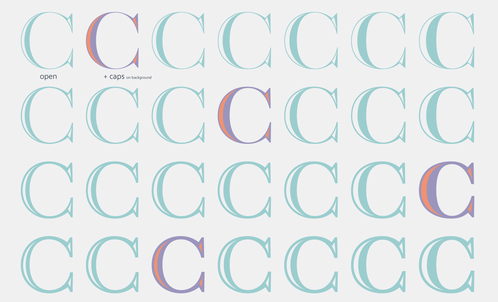
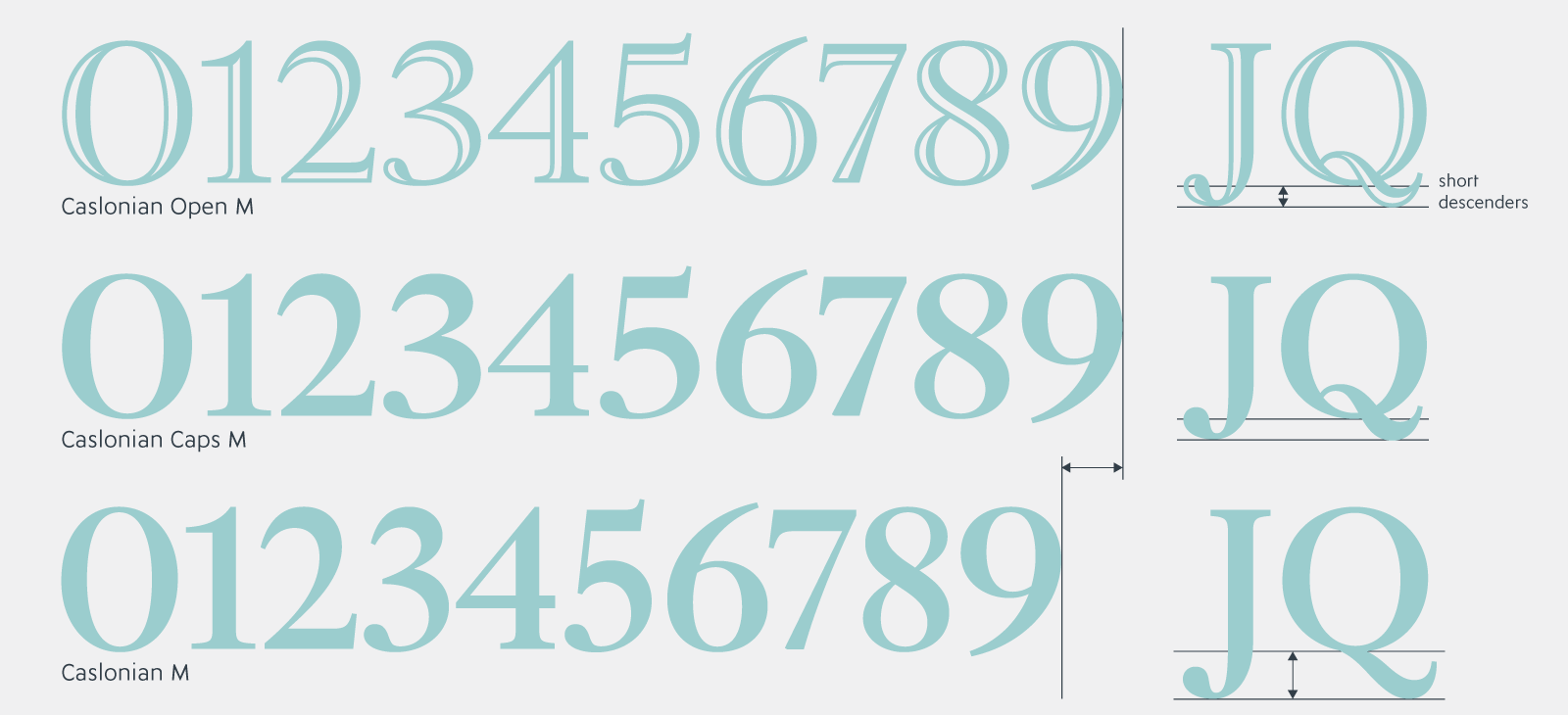
Caslonian Open was added, according to the same optical sizes S, M, L, XL, available in seven weights, in two versions (Open and Caps) that allows the illuminated open part of the letter to be in different color when they are superimposed. The size of the empty-open parts adapts to each styles. The diacritics of the capitals have been drawn shorter to help the tight line spacing of capitals, particularly useful on the cover of magazines. In these headline versions, non-tabular numerals are wider for a more harmonious integration with capital words, as it was practiced at the time of (advertising) phototitling in the 70s and 80s.
Caslonian is part of this very long-term uninted Typofonderie project to propose representative of the history of typography: Apolline–Jenson, Sabon Next–Garamond, PS Fournier–Fournier, Ambroise–Didot, Arsen–Elzevir, Austerlitz–Late Didot. We will see in the longer term, if other design can fit into this story.
— Jean François Porchez
Notes
¶1 ZeCraft, a sister company specialized in typographic design, bespoke typefaces, logotypes. [Reference]
¶2 Anatomy of a Type–3: Caslon, Part 1, by Alexander S. Lawson. [Reference]
¶3 La passion de Stanley Morison, by Maximilien Vox (FR) in Communication et Language, 1975. [Reference]
¶4 William Caslon, Britannica biography. [Reference]
¶5 Caslon, Baskerville, and Franklin: Revolutionary types by Martin McClellan, 2009. [Reference] In praise of printing and a favorite Ben Franklin typeface by Jaap Harskamp, 2020. [Reference]
¶6 Various specimens from Fonderie Caslon, 1913–1982, Bibliothèques de la ville de Paris, France. [Reference]
¶7 A specimen of printing types, William Caslon, 1785, University of California Libraries, United States. [Reference]
¶8 Typecasting: The Use (and Misuse) of Period Typography in Movies, Mark Simonson, 2001. [Reference]
¶9 About FB Big Caslon, Matthew Carter, Type Network. [Reference] Genuine Imitations, a Type Designer’s View of Revivals, recap of Matthew Carter’s 2016 Lieberman Lecture. [Reference]
¶10 The Most Trusted Name in Letters, by Steven Heller in Print Magazine, 2019. [Reference]. Fact: a periodical by Ralph Ginzburg, designed by by Herb Lubalin. [Reference] [Reference]
Acknowledgements
To Stéphane Elbaz who is at the initiative of the contact with Estée Lauder. Then, in order of appearance since 2015, I thank those who contributed to the development of Caslonian: Roxane Gataud, Joachim Vu, Benjamin Blaess, Morgane Pambrun, Antoine Brun, Fanny Hamelin, Léo Guibert. Each, in his own way, will have contributed to extensions such as small caps, additional numerals, weight optimisation in Small cap version, Open and Caps versions, Ornaments extensions, kerning, production, tests and so many other small details inherent in the development of a typeface project over several years. Not to mention Véronique Porchez for the implementation in database and license. — jfp.